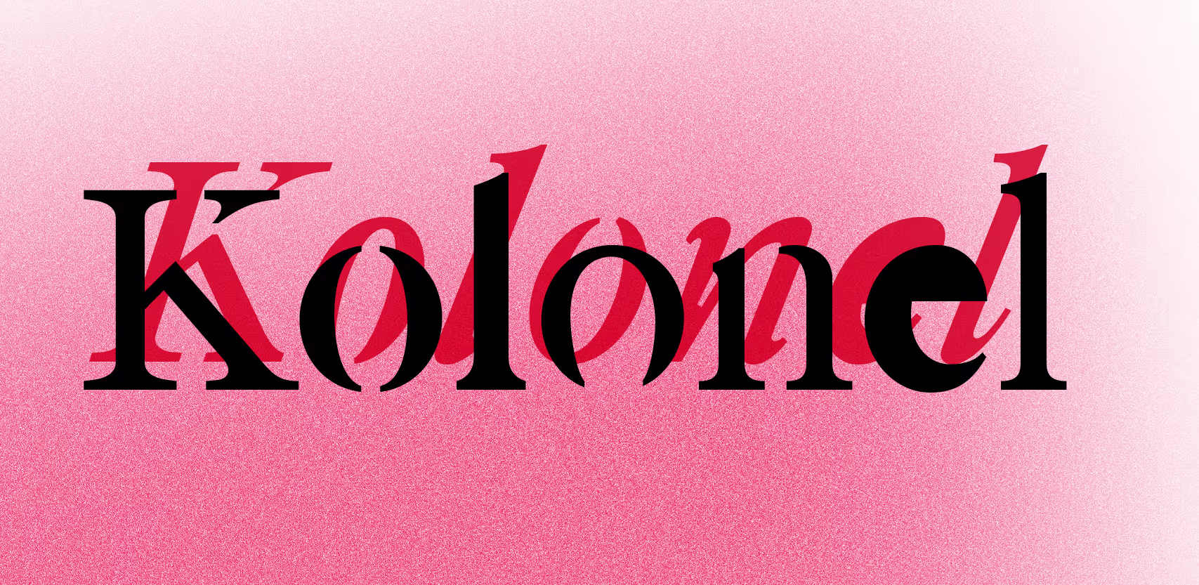
The Kolonel Family
Supported Languages ()
English, French, German, Spanish, Portuguese, Italian, Dutch, Danish, Swedish, Norwegian, Finnish, Icelandic, Faroese, Polish, Czech, Slovak, Hungarian, Romanian, Turkish, Slovenian, Croatian, Estonian, Latvian, Lithuanian, Catalan, Galician, BasqueTry it!
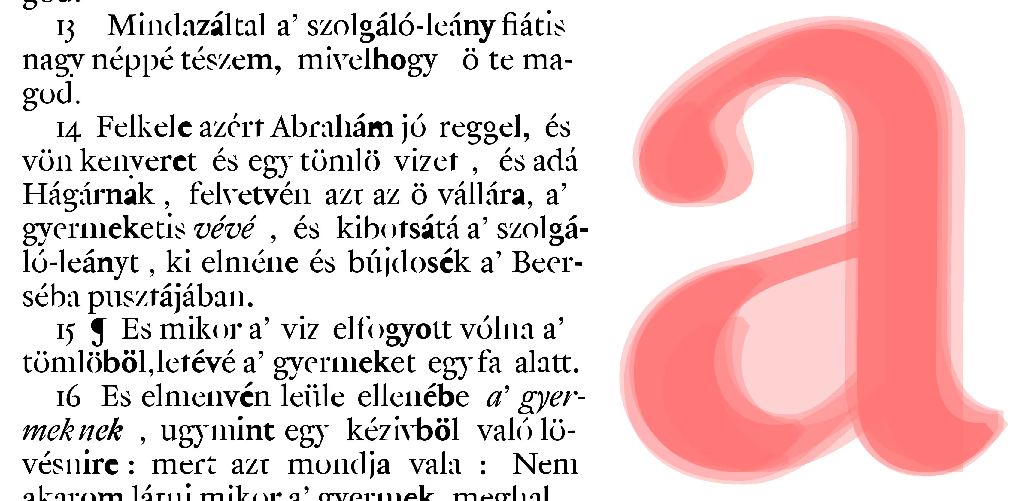
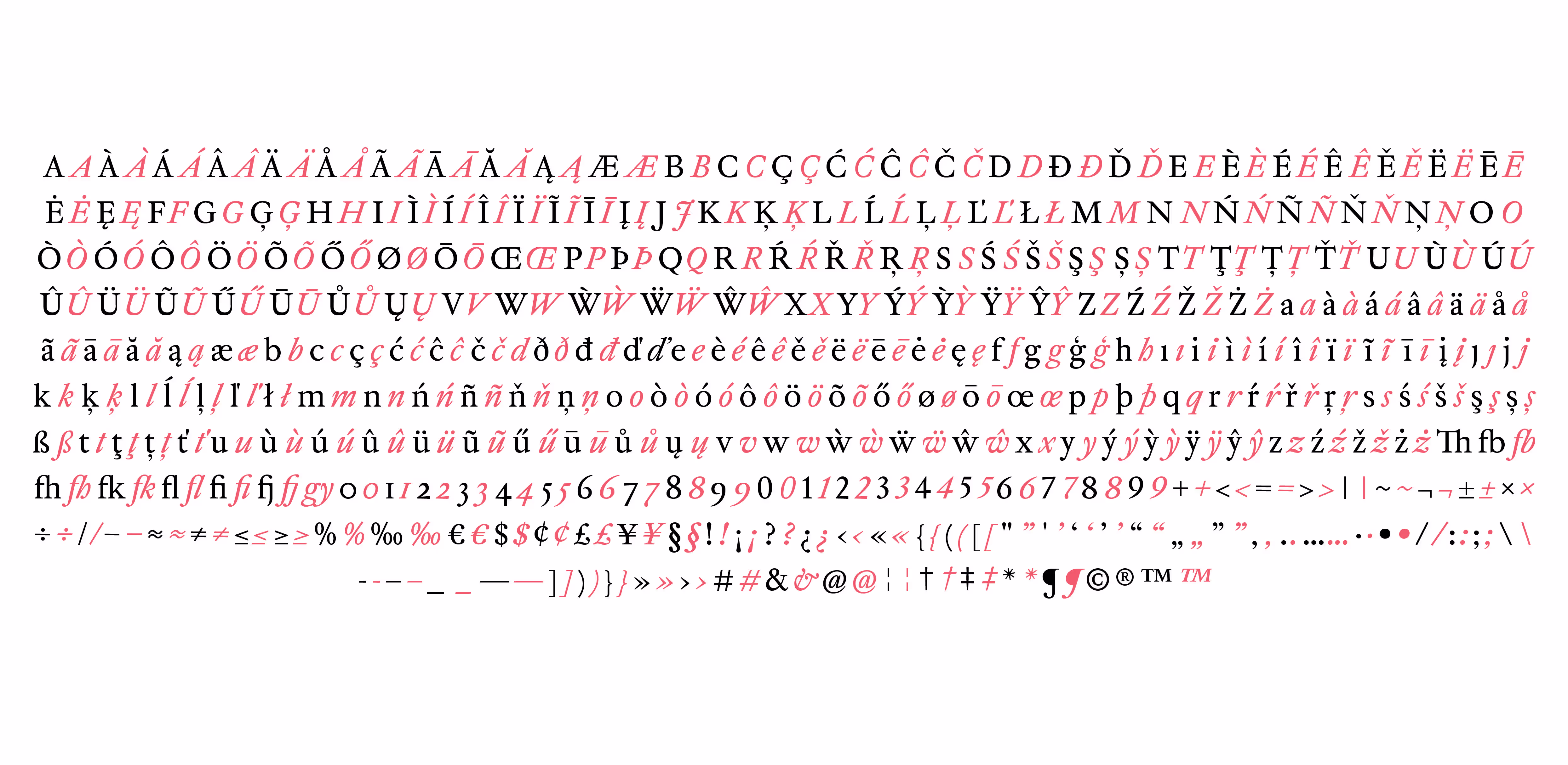
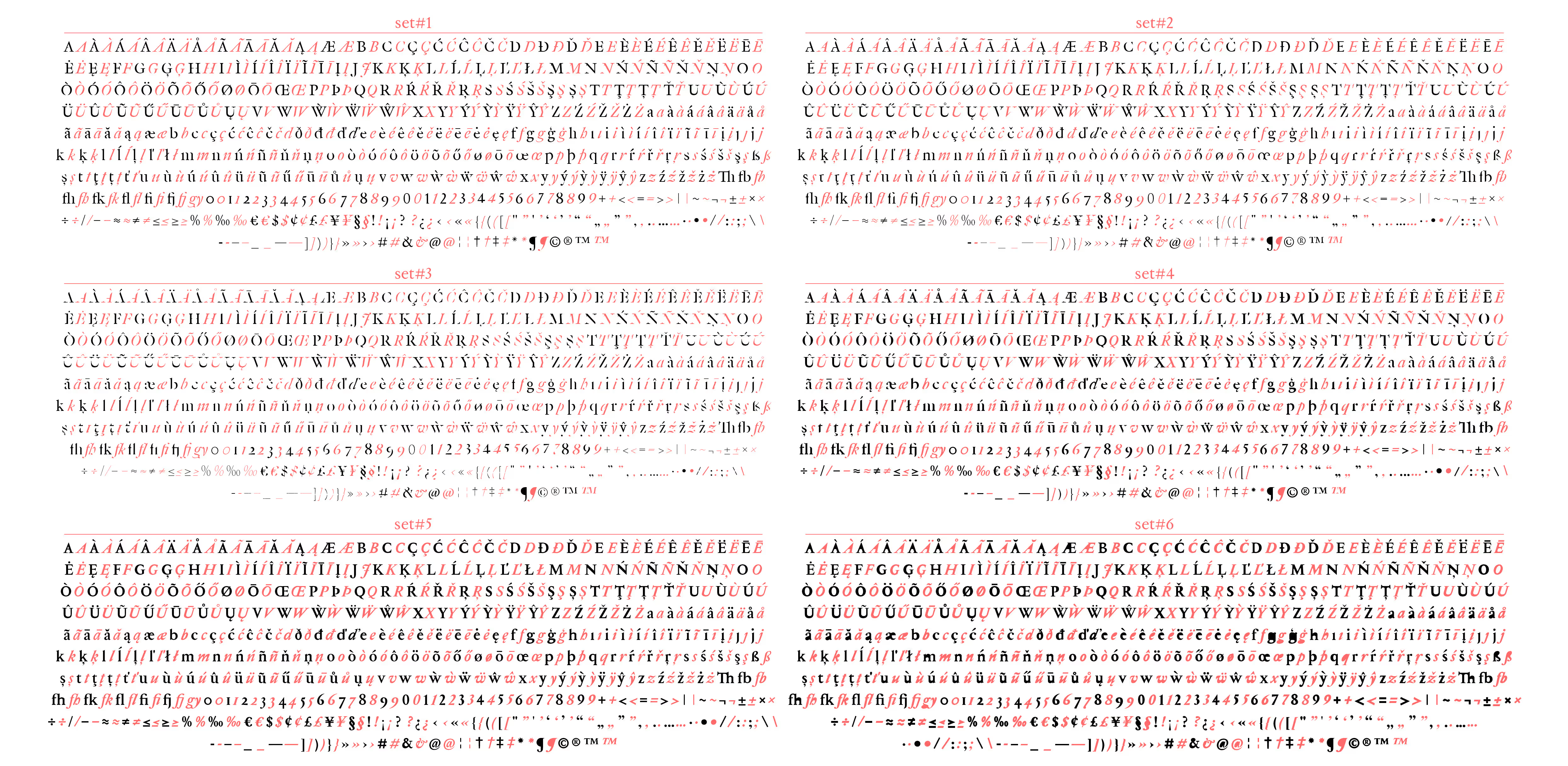
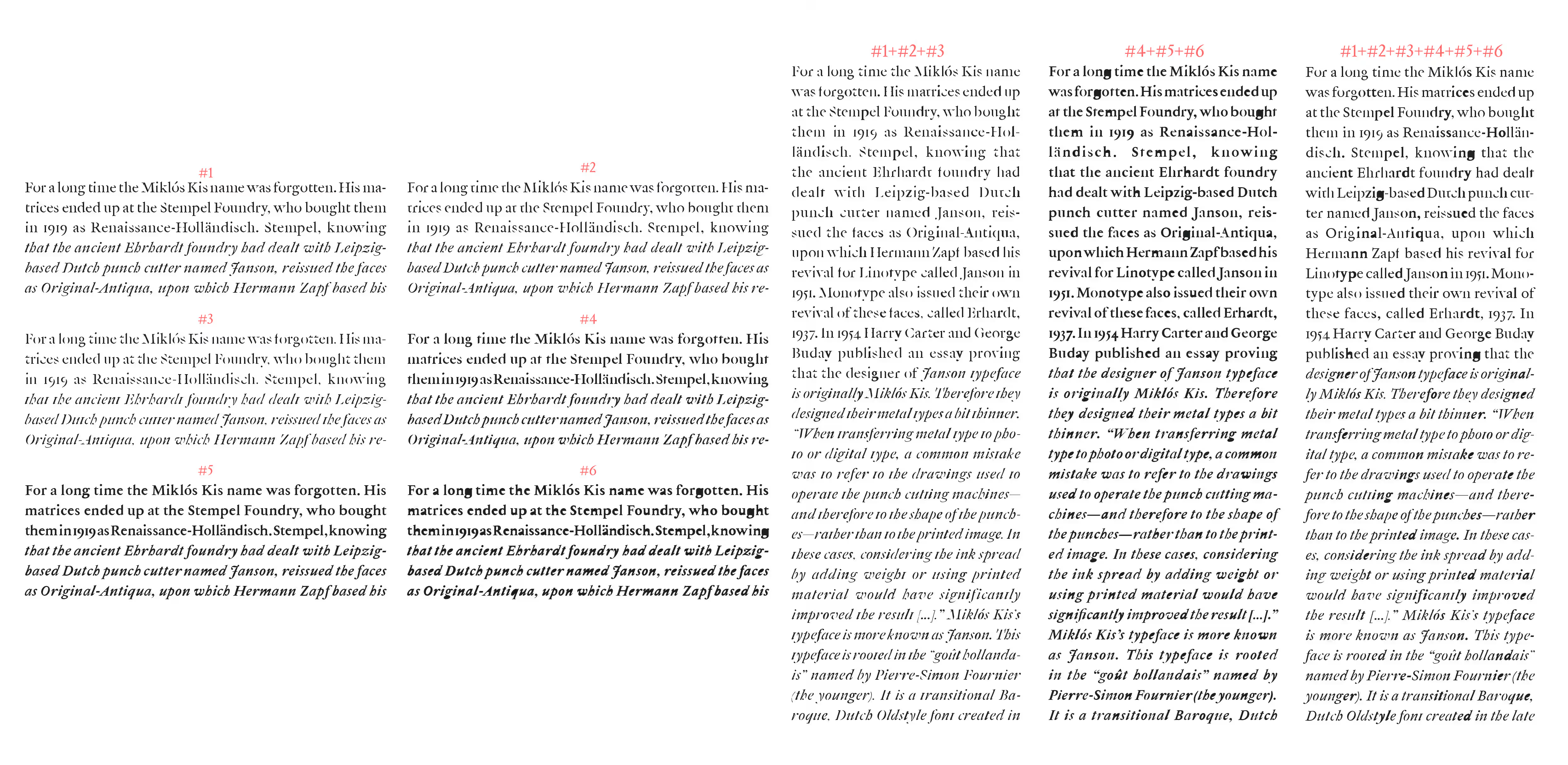
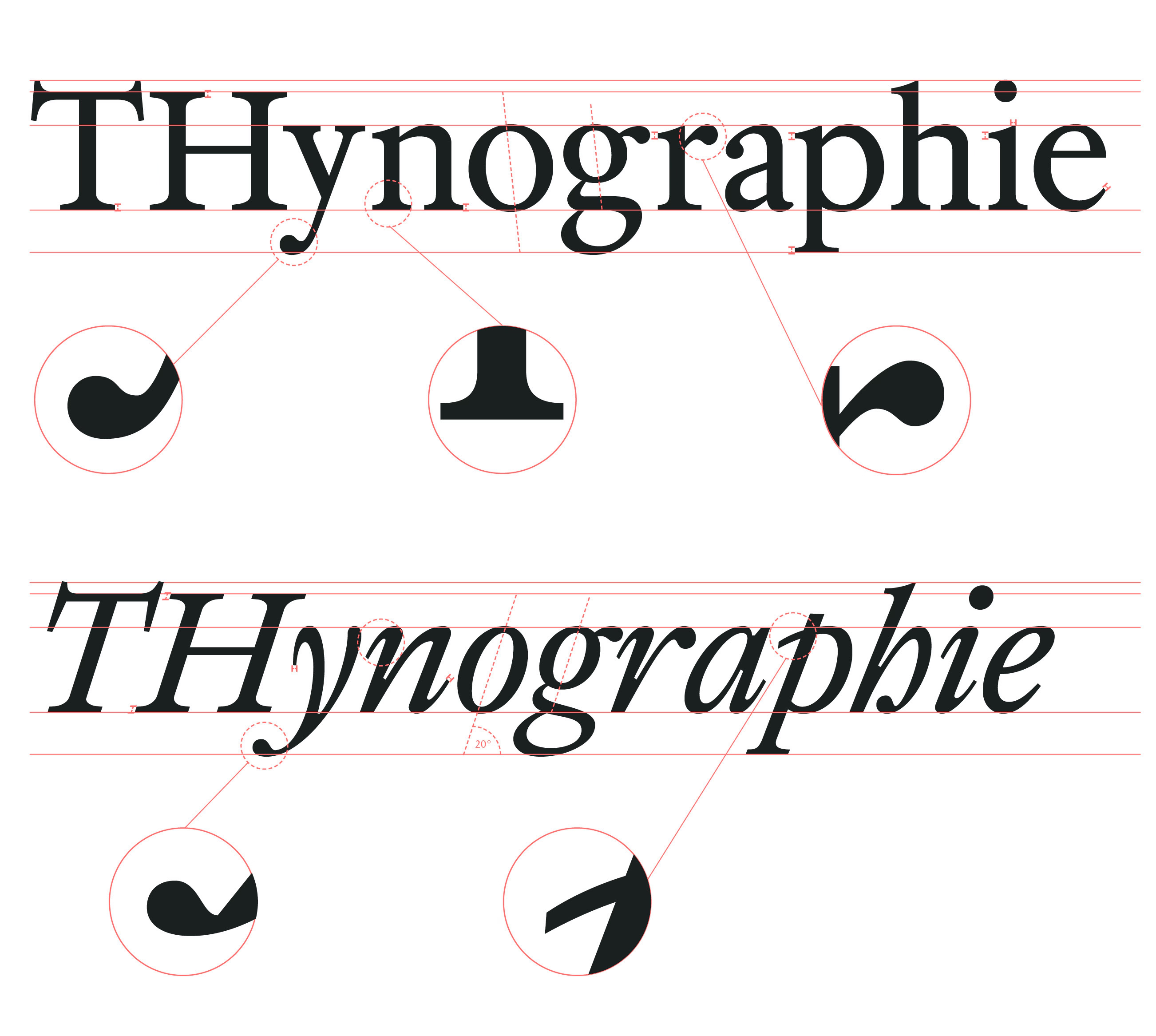
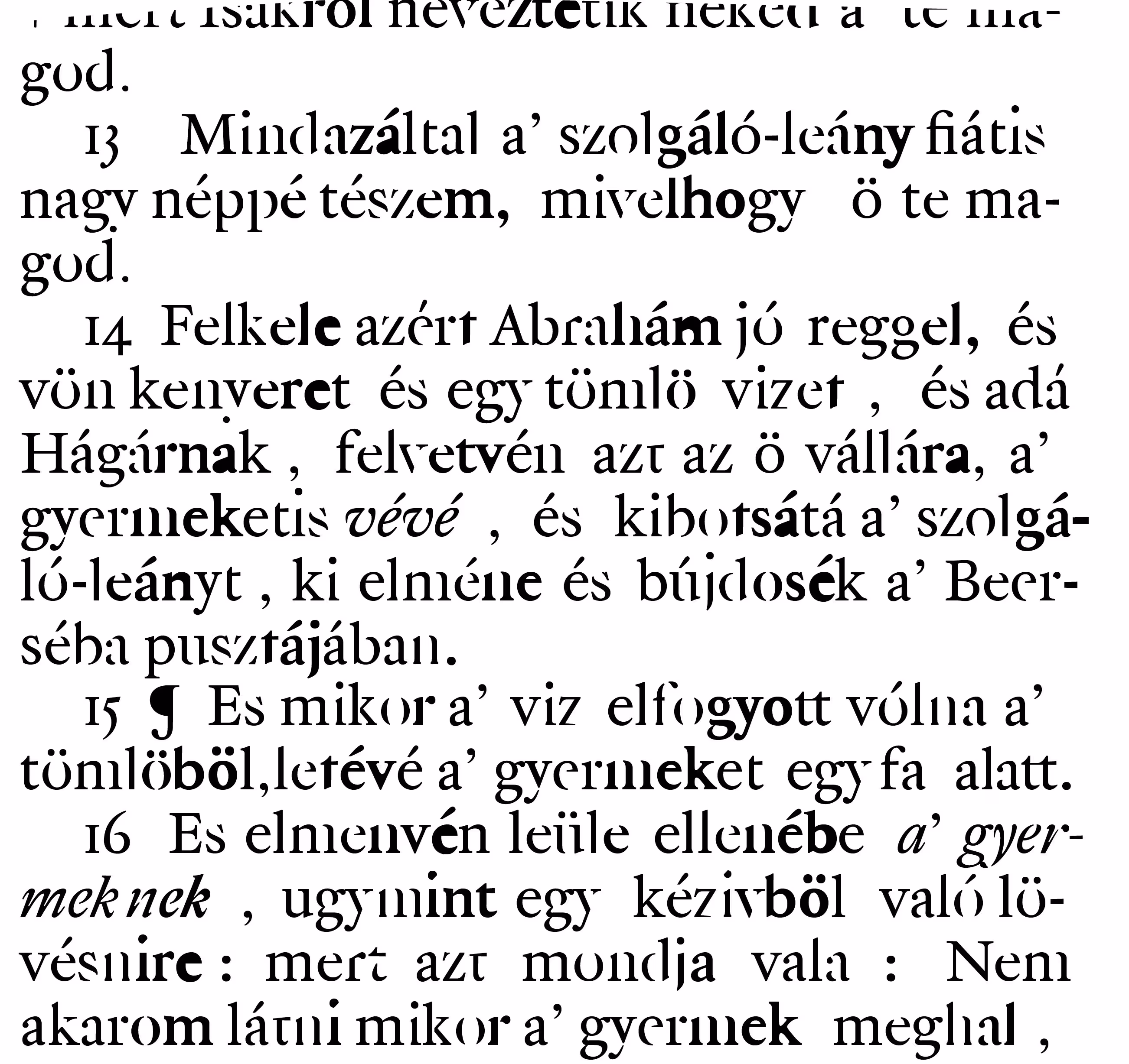
“Kolonel” is a Dutch Old Style typeface inspired by the letterforms of Nicholas Kis (Tótfalusi Kis Miklós). The design is based on the 7-point text size (colonel - hence the name), both printed and designed by Nicholas Kis for his Bible, created in Amsterdam in 1685.
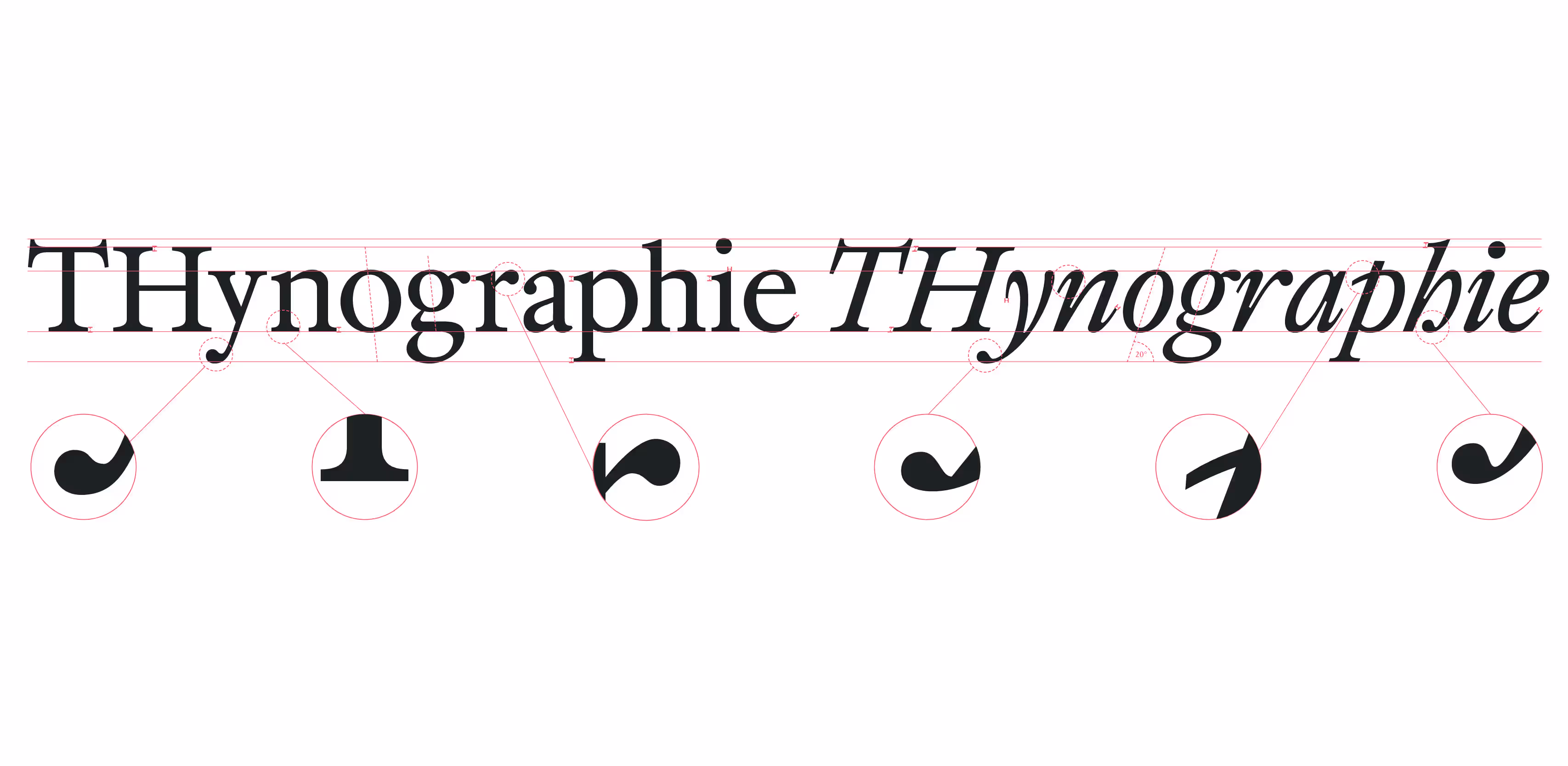
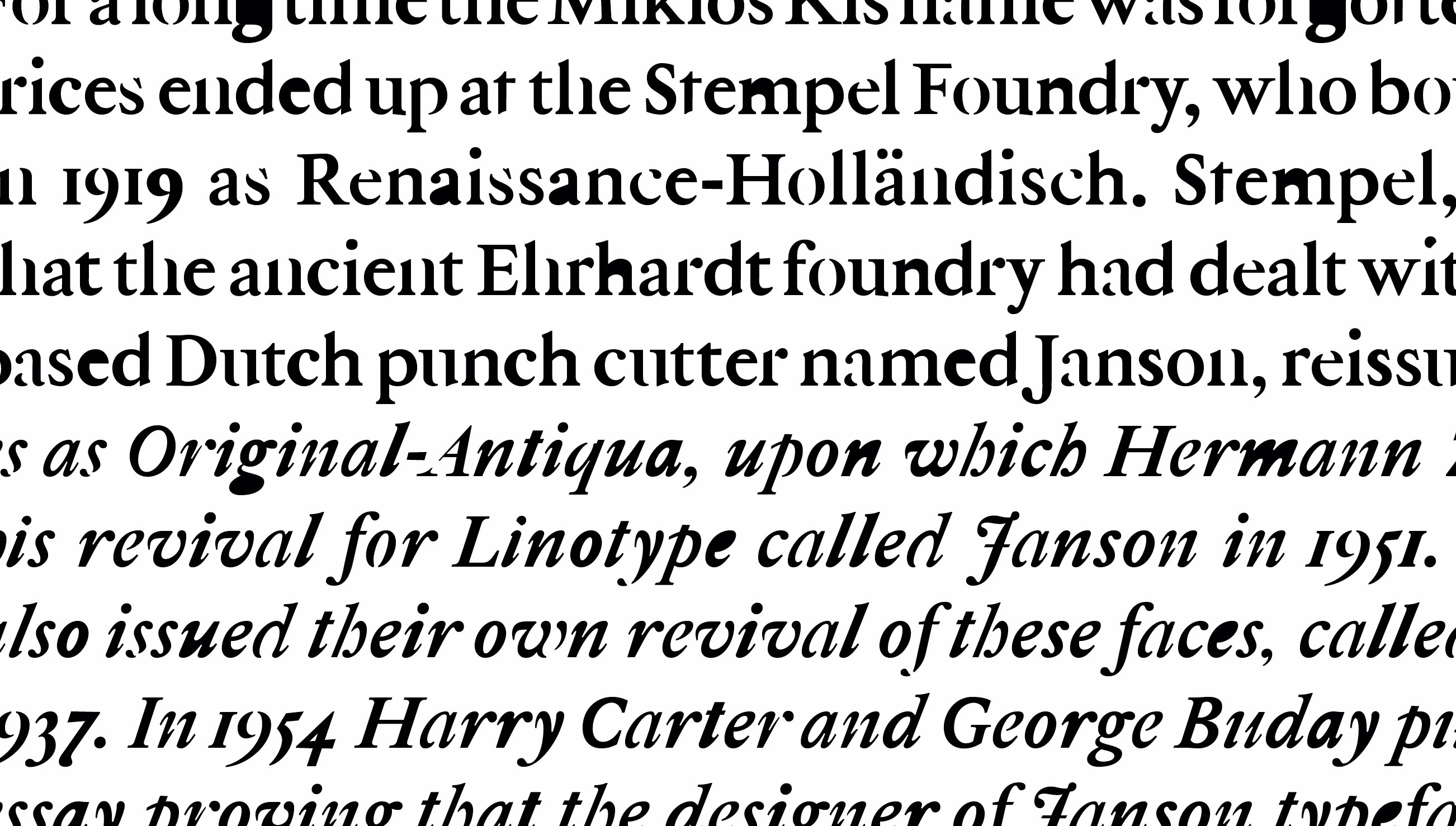
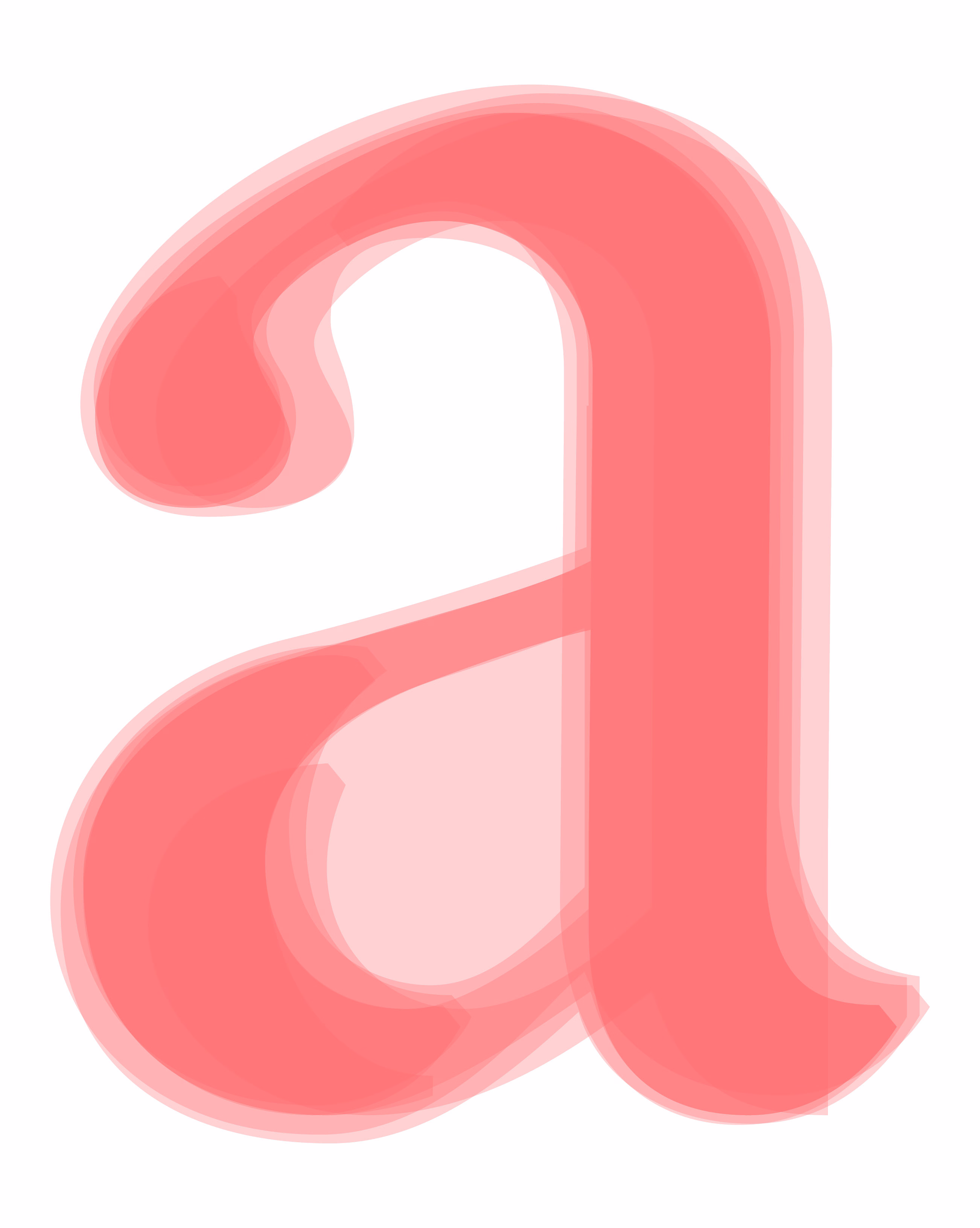
This experimental typeface aims to fluidly translate the vibrant essence of letterpress-printed text into the digital world. The project embarked on a journey of exploring various modifications for each letter, drawing inspiration from authentic ink trapping issues observed in Nicholas Kis's Bible. To maintain consistent proportions across lowercase, uppercase and other glyphs in both the regular and italic styles, a uniform design approach was applied.
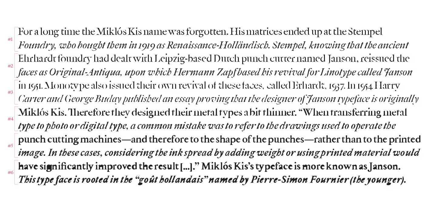
Kolonel is specifically designed for extended text settings and performs best at reading sizes ranging from 9 to 12 points. Its true strength, however, emerges when the different styles—such as the broken and ink trapped variations—are used at large sizes.
How to License The Kolonel Family?
Note: External licensing terms may apply.
Interested in using The Kolonel Family? Send an email to: miklos@accentype.xyz
Include your project details and I'll send you licensing options and pricing within 48 hours.