
Constantin Bold
Supported Languages ()
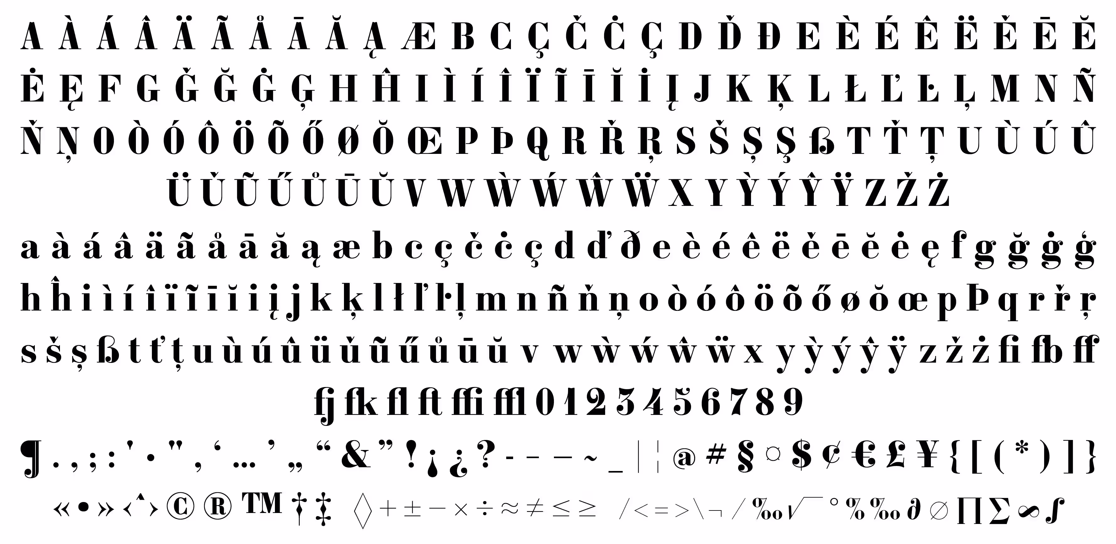
English, French, German, Spanish, Portuguese, Italian, Dutch, Danish, Swedish, Norwegian, Finnish, Icelandic, Faroese, Polish, Czech, Slovak, Hungarian, Romanian, Turkish, Slovenian, Croatian, Estonian, Latvian, Lithuanian, Catalan, Galician, BasqueTry it!
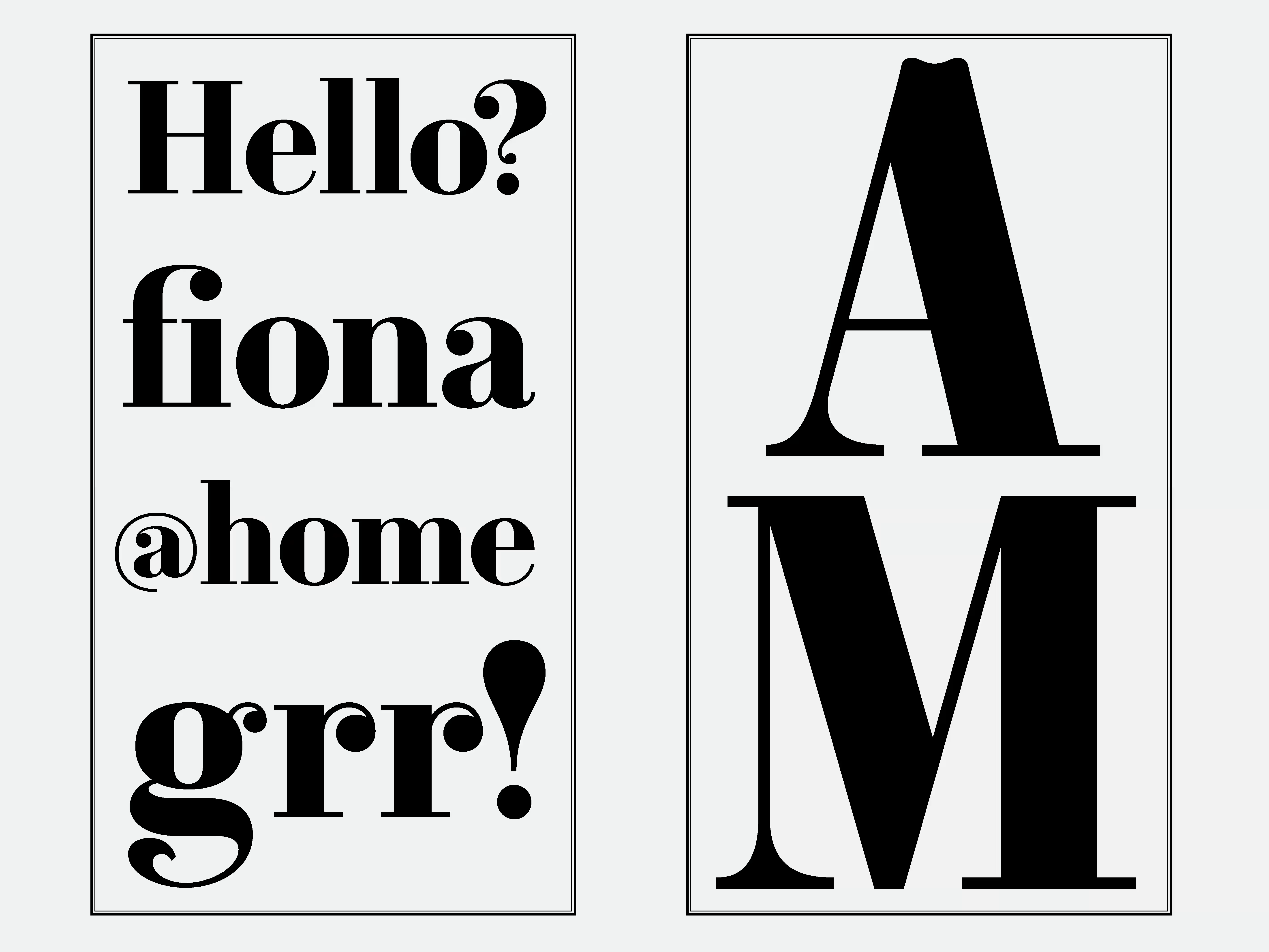
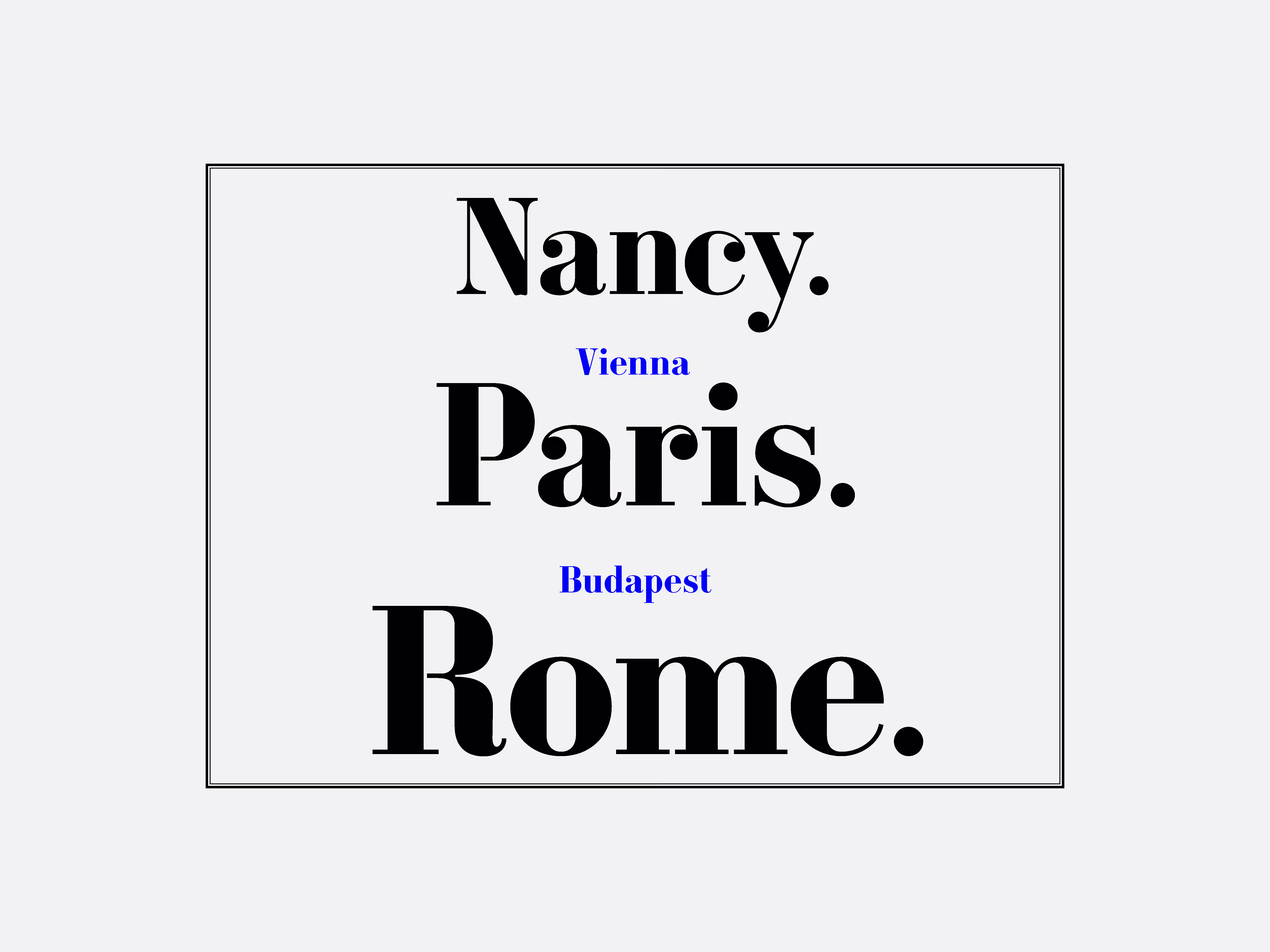
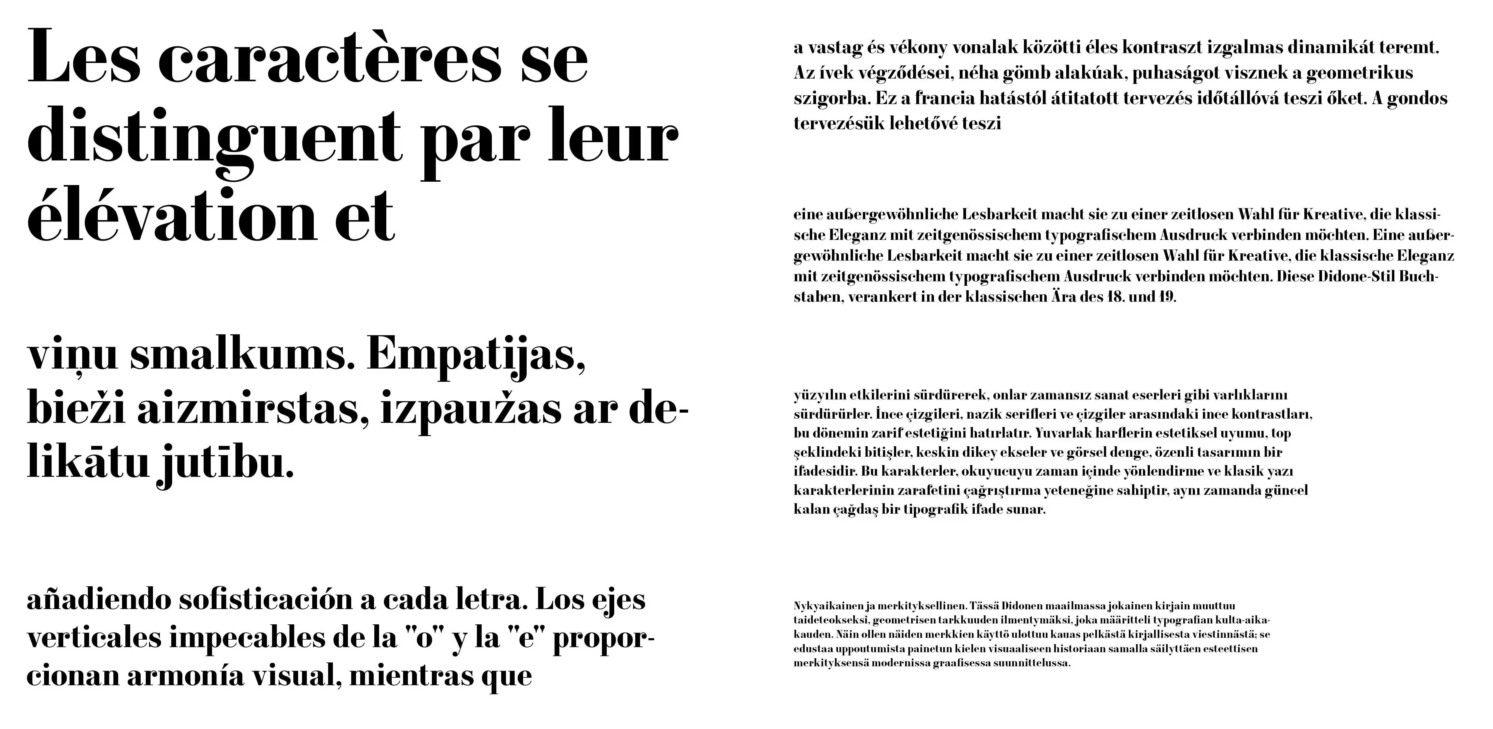
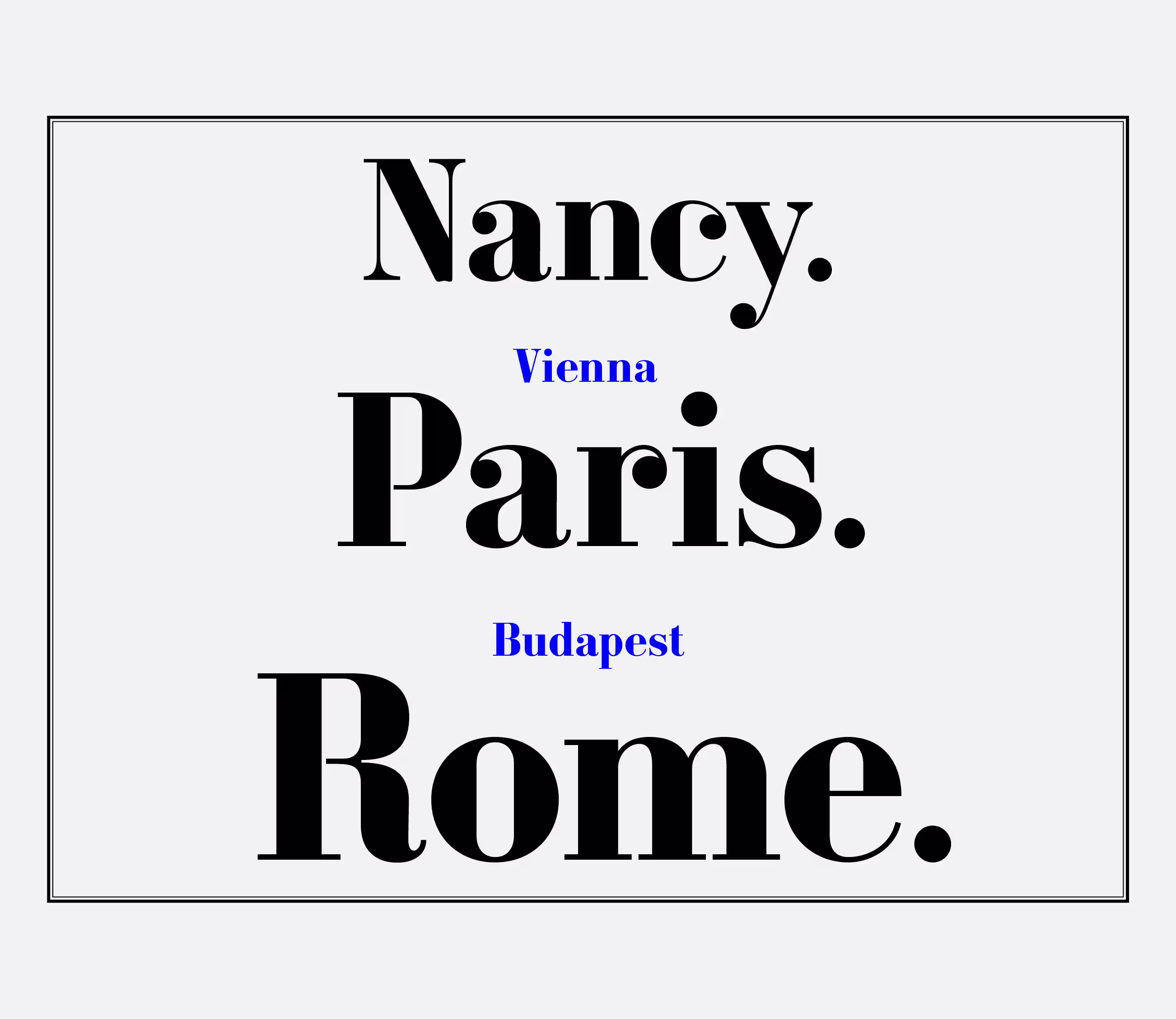
Drawing inspiration from the work of the Constantin widows, whose foundry was active in Nancy, France, during the 19th century, I designed this bold Didone-style typeface. The "Constantin" typeface is a display typeface intended for versatile use over time.
This typeface interprets the original design of the original typeface, with initial sketches based on letters of “gros cannon” size. While taking inspiration from the graphic style of the 19th century, the design adjusts to modern standards with a larger x-height and sharper cuts, for example.
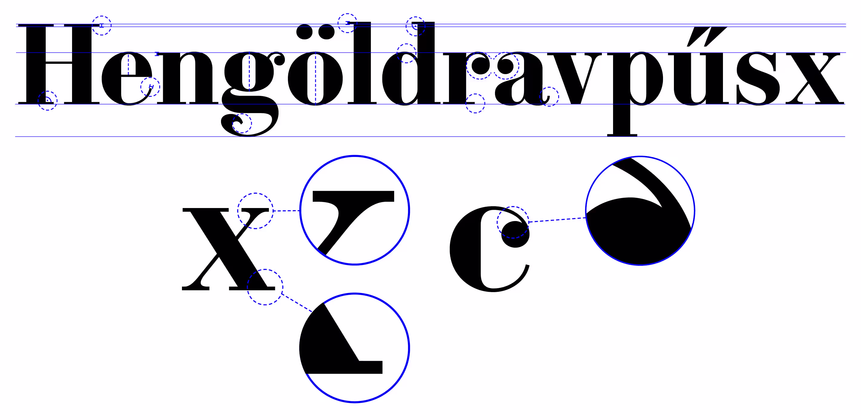
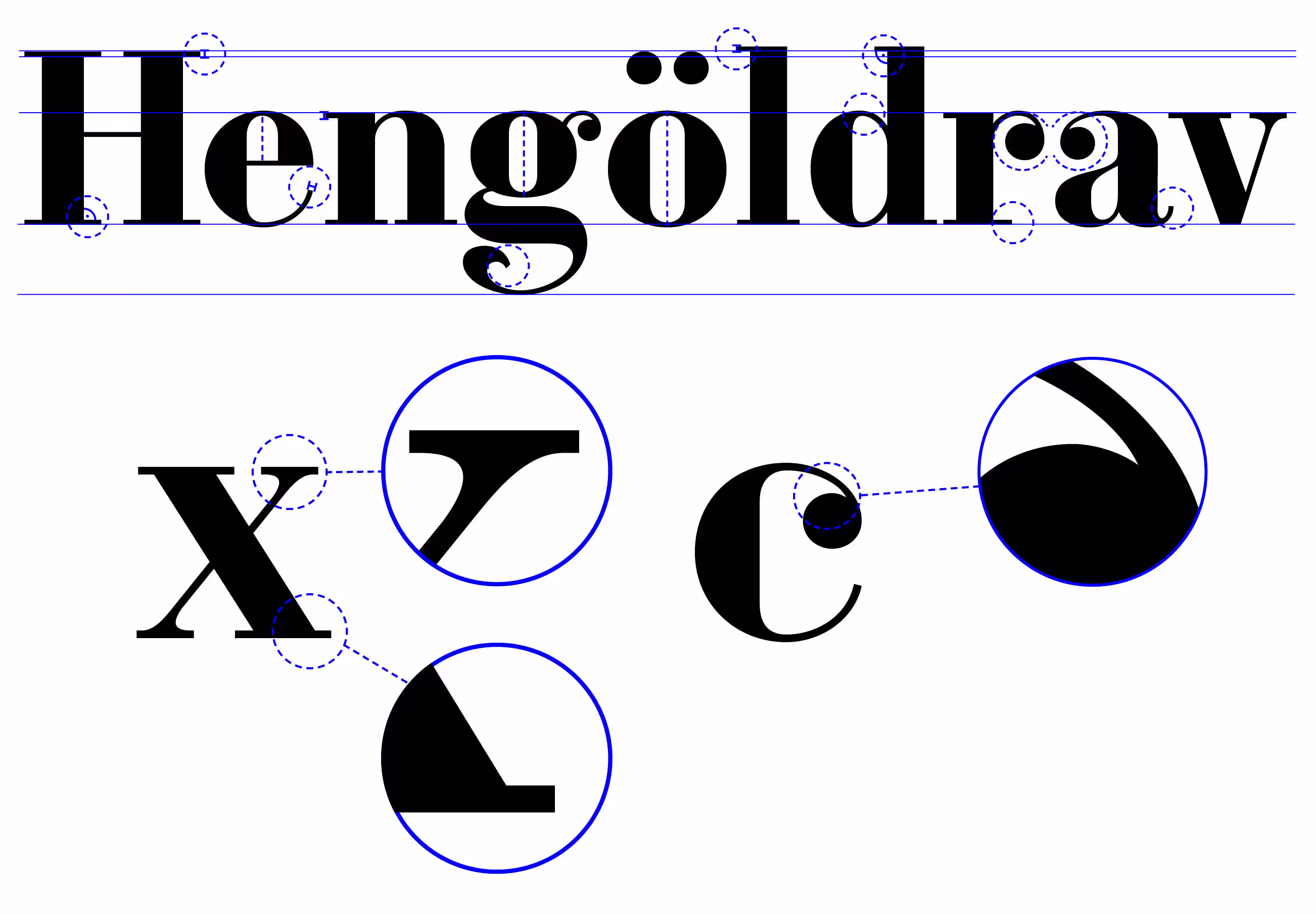
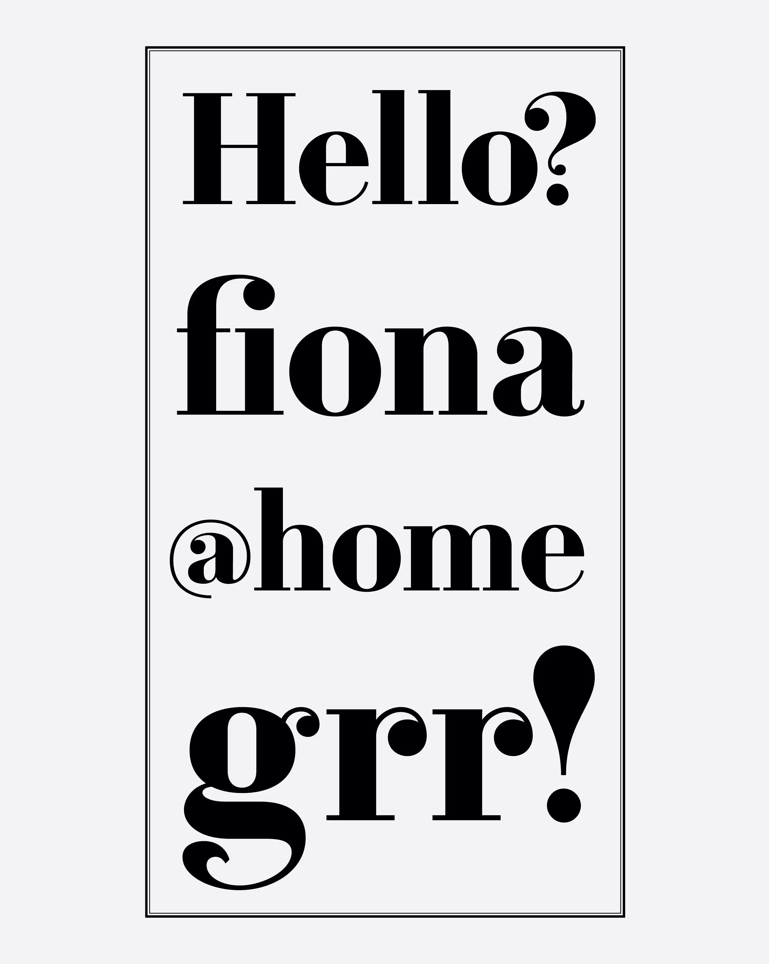
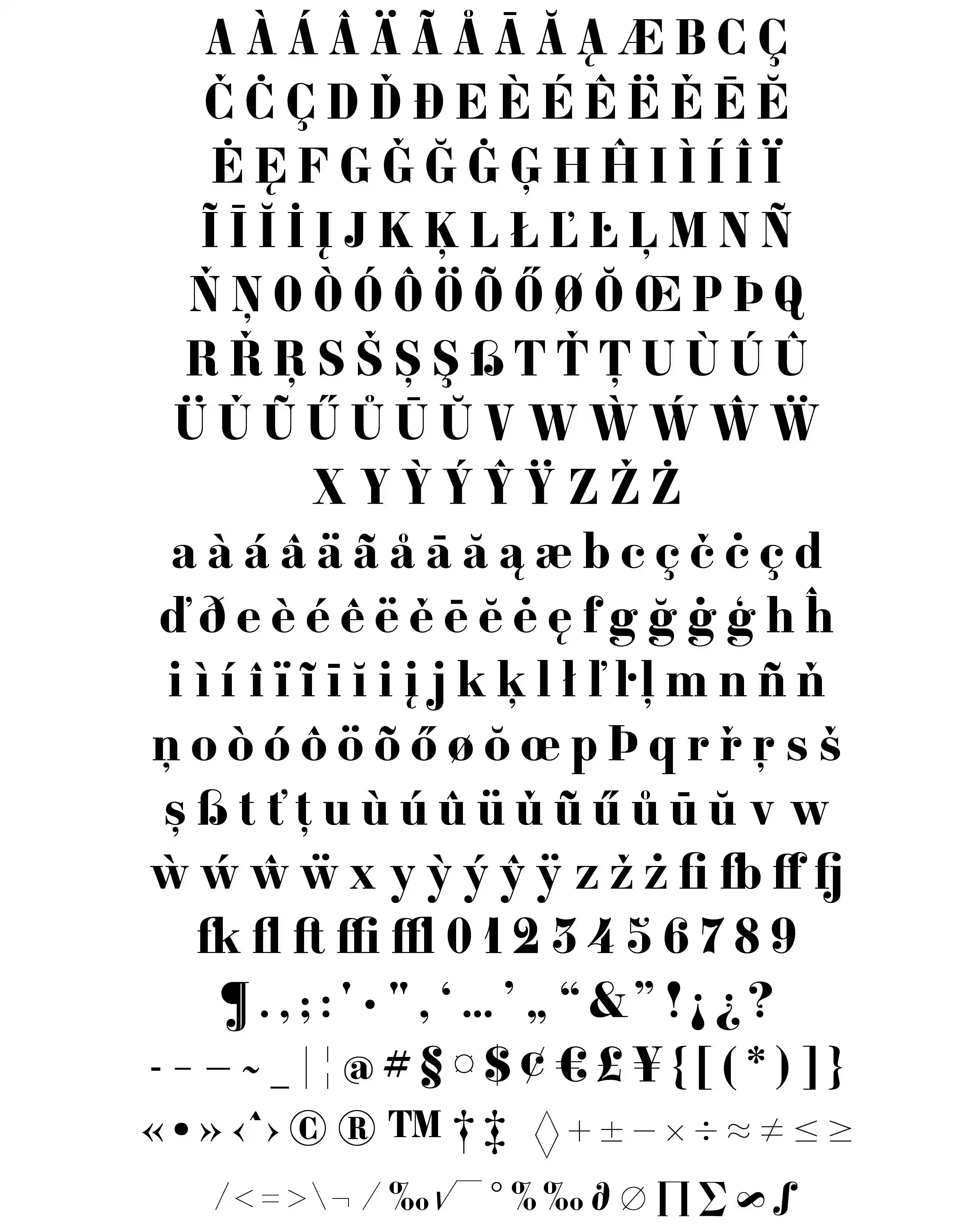
With Constantin being a Didone-style typeface, the axis of the o has a precisely vertical stress, as well as that of the e, g and all the round letters. In many cases, the stroke terminals are ball-shaped. However, rather than bridging the ball and the stroke with a lightly curved arc, the terminal is adjoined at an acute angle, signifying the insertion of the typeface into the digital medium. The contrast between thin and thick lines is abrupt and dramatic, and the width of the thin strokes is always the same and is equal to the height of the serifs. The serifs are unbracketed and thin. In sum, the typeface was constructed in a systematic and logical fashion: the shapes can be divided into separate groups, creating a coherent system, and rendering the texture vibrant yet legible.


How to License Constantin Bold?
Note: External licensing terms may apply.
Interested in using Constantin Bold? Send an email to: miklos@accentype.xyz
Include your project details and I'll send you licensing options and pricing within 48 hours.