
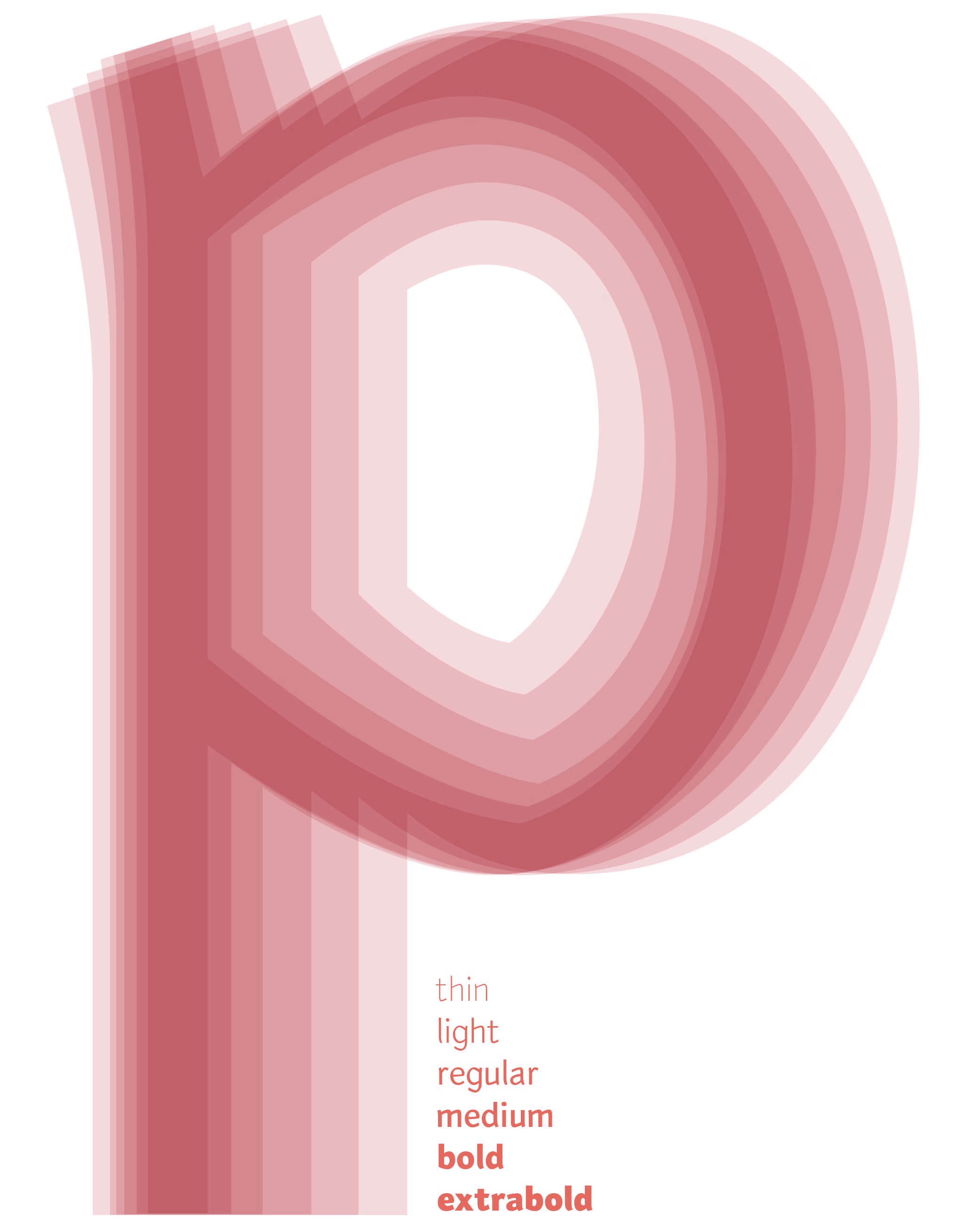
Brickstone Variable
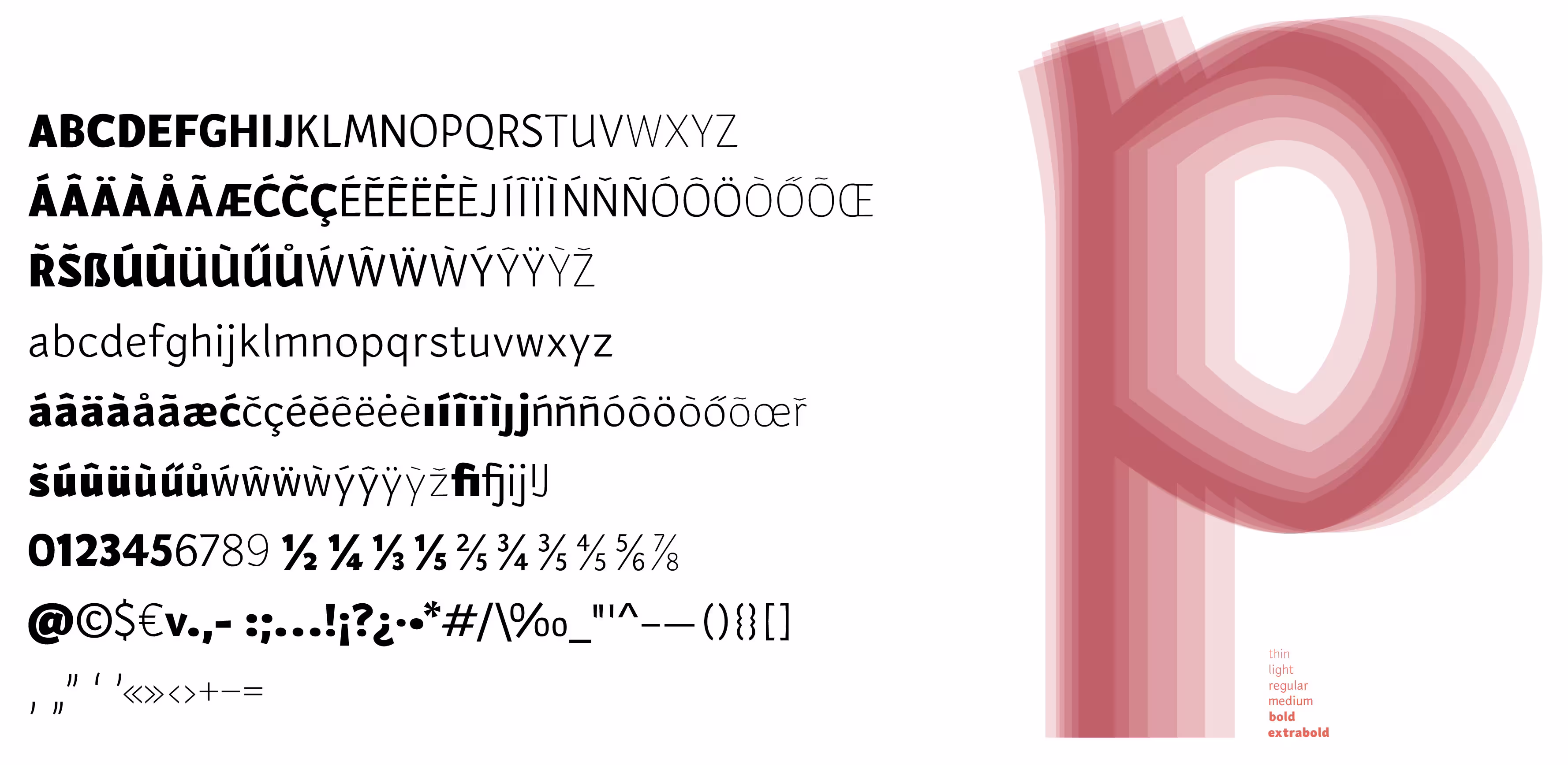
Supported Languages ()
Albanian, Basque, Bosnian, Catalan, Croatian, Czech, Danish, Dutch, English, Estonian, Faroese, Finnish, French, Galician, German, Hungarian, Icelandic, Irish, Italian, Latvian, Lithuanian, Maltese, Norwegian, Polish, Portuguese, Romanian, Scottish Gaelic, Slovak, Slovenian, Spanish, Swedish, Turkish, WelshTry it!
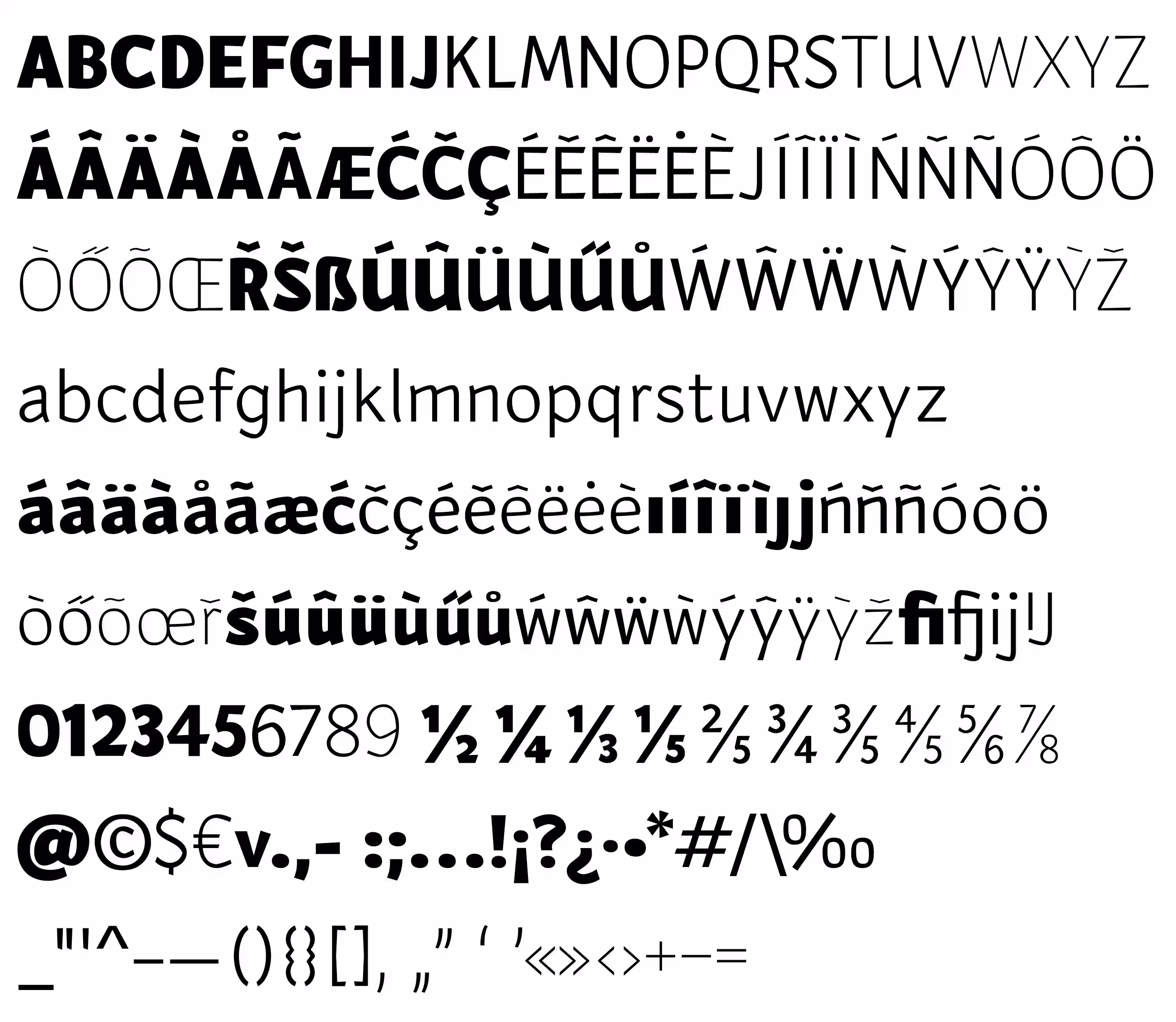
Brickstone is a humanist sans-serif typeface in a variable font format, ranging from thin to extra bold. The name “Brickstone” subtly references small incisions and sudden breaks, evoking the way stone or brick fractures, while also suggesting a sense of bold solidity. Additionally, it includes a playful reference to Brixton, the vibrant district in South London where the typeface first took shape.
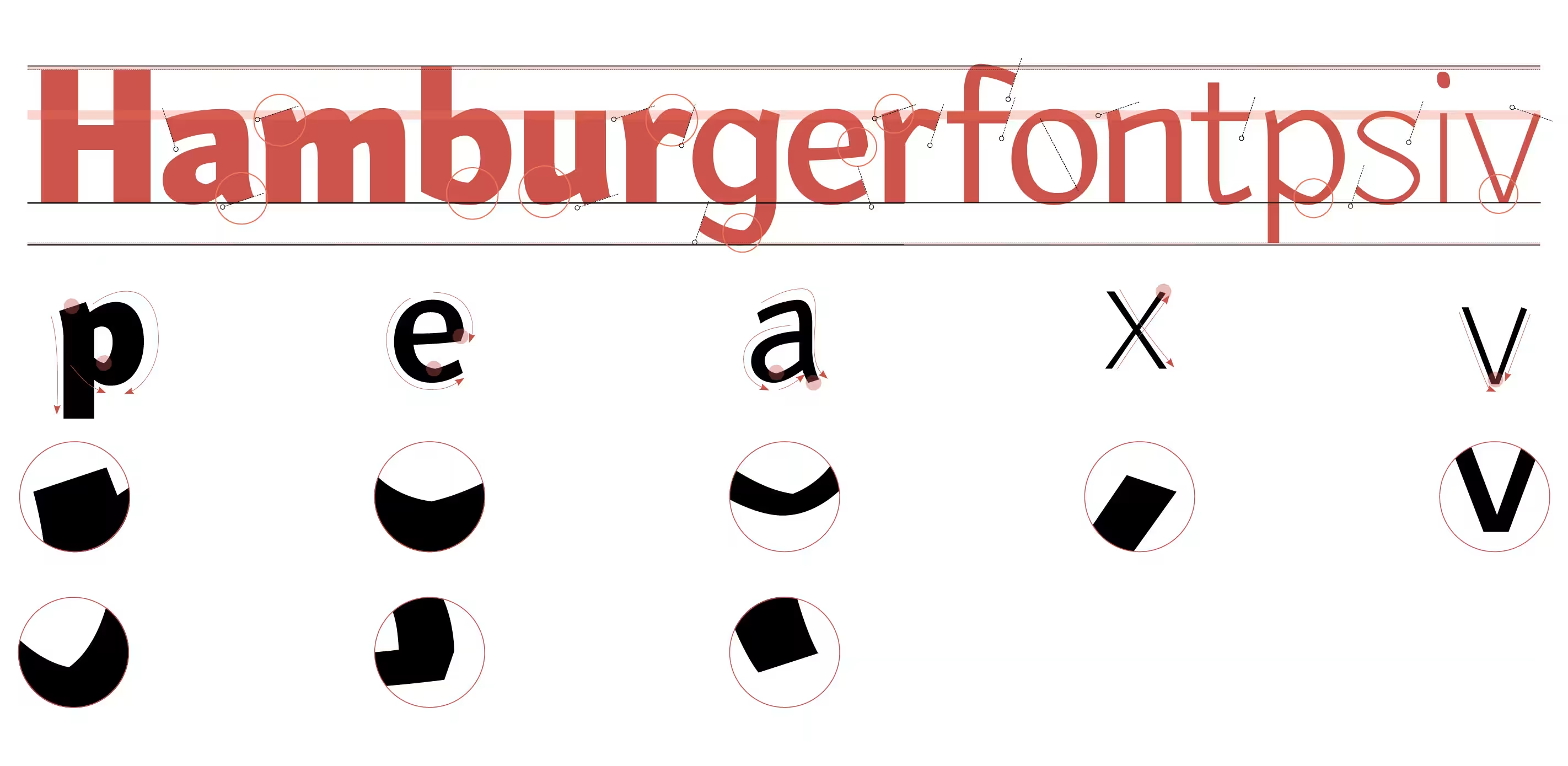
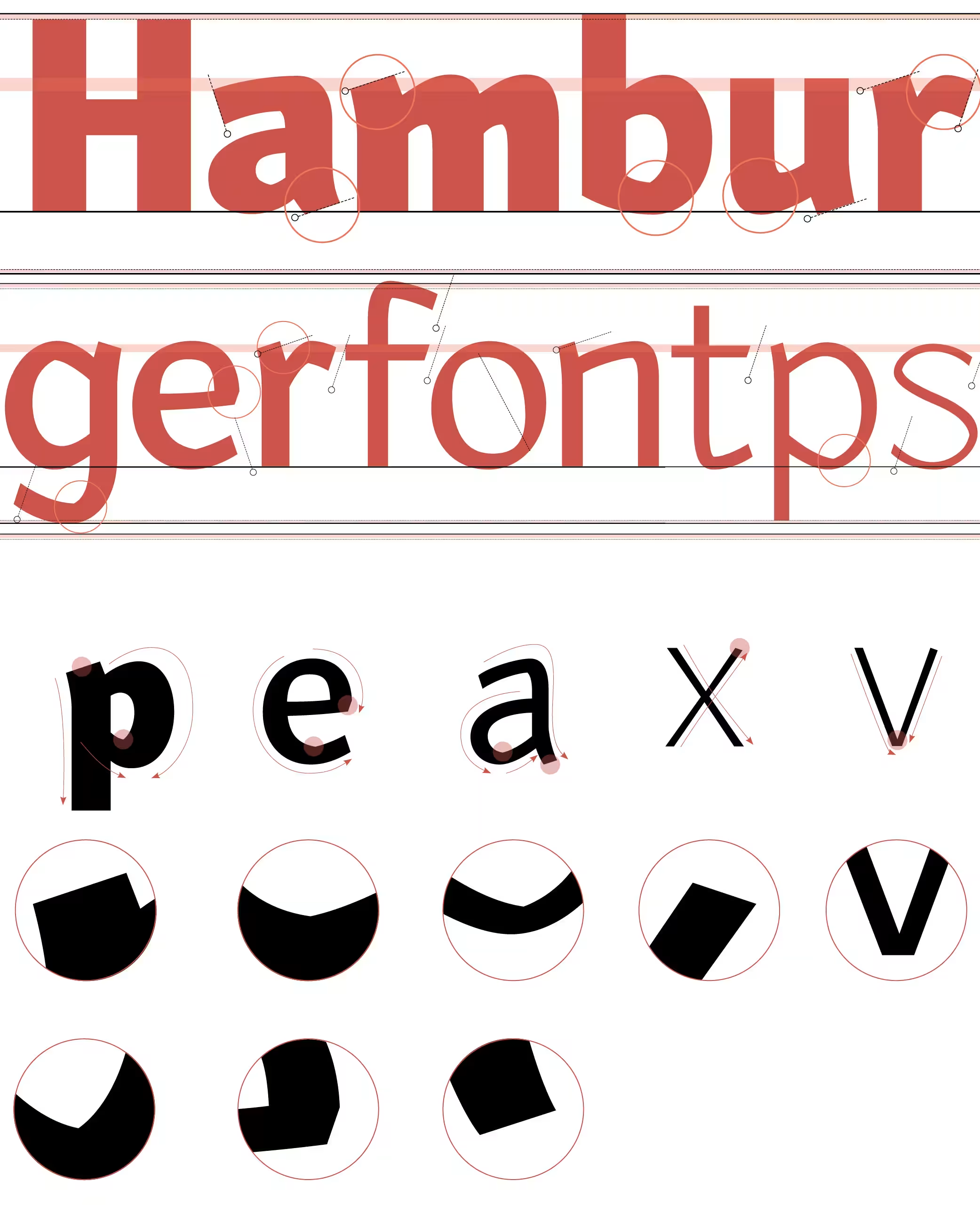
The smooth flow of its curves is punctuated by sharp, unexpected angles. Its structural character lies somewhere between broad-nib calligraphy and stone carving, combining these influences into a cohesive sans serif family. Brickstone maintains a distinctive voice without being intrusive. It is a sans serif that feels quietly unique while remaining highly versatile.
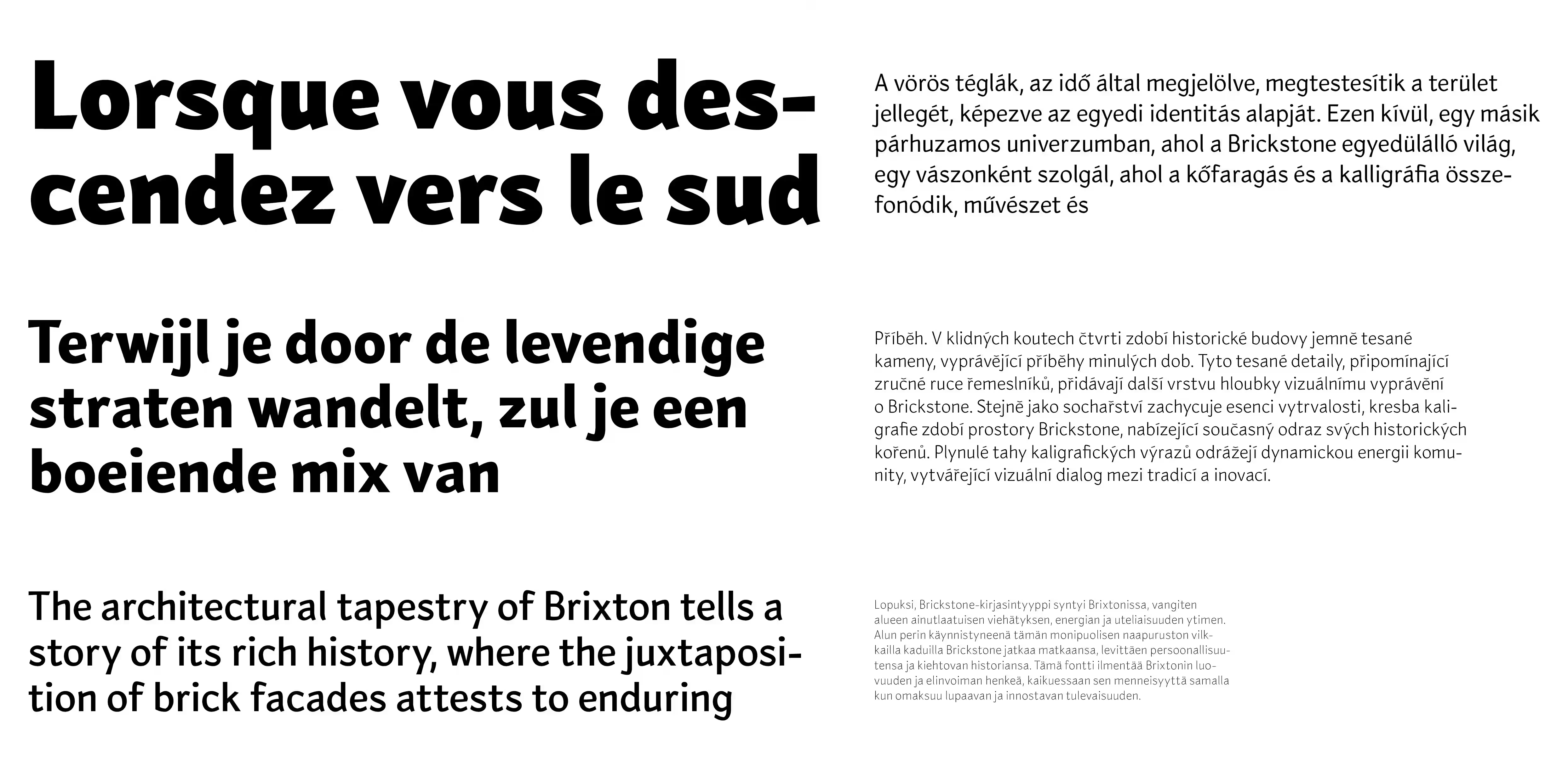
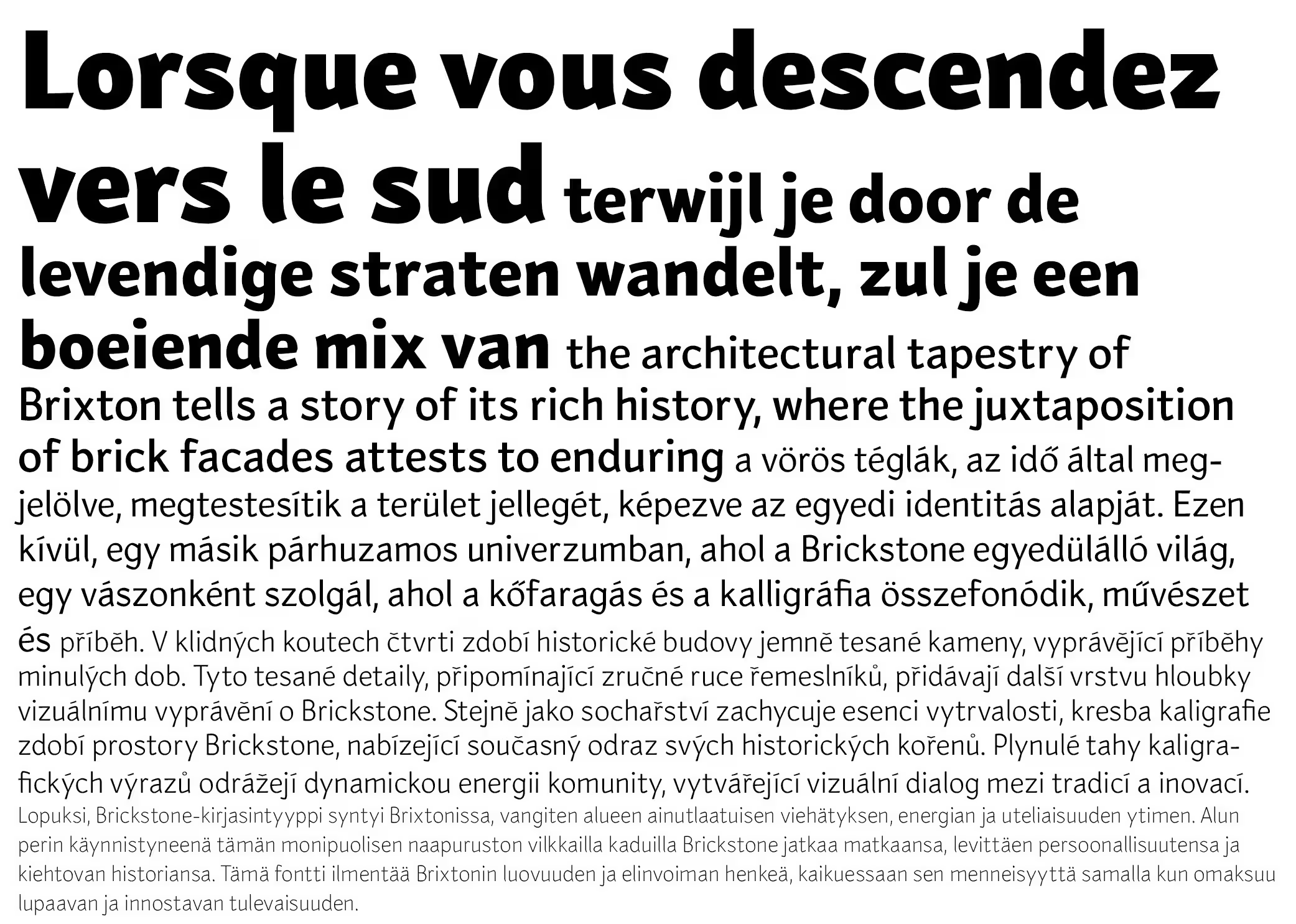
Brickstone works well in display settings while remaining clear and legible in continuous text. Its generous x-height supports readability at smaller sizes, and its carefully considered details bring a clean, refined texture to both print and digital layouts. This makes it a flexible option for branding, editorial design, and user interfaces.
How to License Brickstone Variable?
Note: External licensing terms may apply.
Interested in using Brickstone Variable? Send an email to: miklos@accentype.xyz
Include your project details and I'll send you licensing options and pricing within 48 hours.